Property and casualty insurance company portfolios share a few systematic bets. These crowded bets are the main sources of the industry’s and many individual companies’ relative investment performance. Since the end of 2013, these exposures have cost the industry billions.
Identifying Property and Casualty Industry Crowding
This analysis of property and casualty (P&C) insurance industry portfolios resulted from collaboration with Peer Analytics, the only provider of accurate peer universe comparisons to the insurance industry.
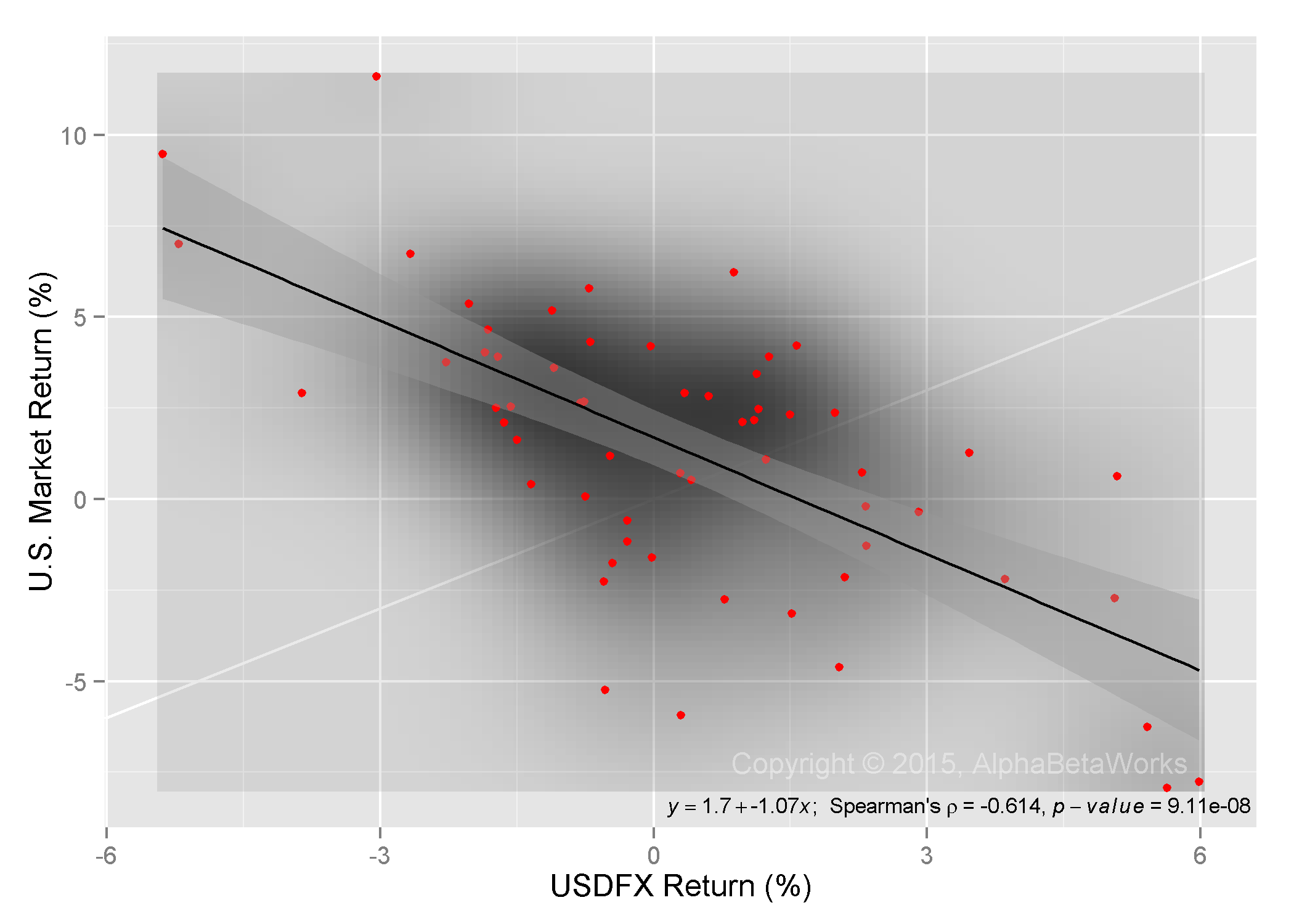
In analyzing property and casualty industry portfolios, we follow the approach of our earlier articles on crowding: We created a position-weighted portfolio (P&C Aggregate) consisting of all property and casualty insurance portfolios reported in regulatory filings. P&C Aggregate covers over 1,300 companies with total portfolio value over $300 billion. We analyzed P&C Aggregate’s risk relative to Russell 3000 index (a close proxy for the U.S. Market) using AlphaBetaWorks’ Statistical Equity Risk Model to identify sources of crowding.
Property and Casualty Industry 2014-2015 Underperformance
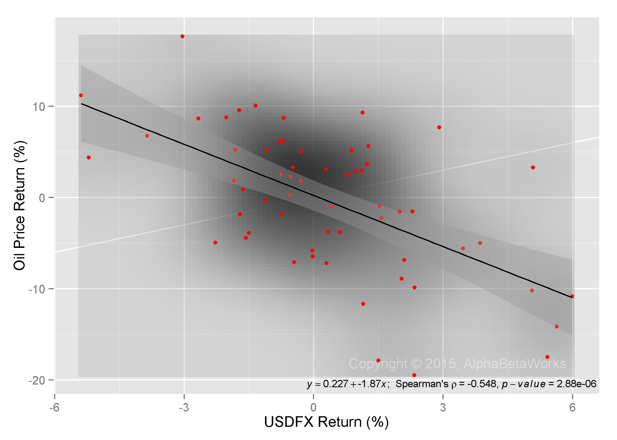
P&C Aggregate systematic (factor) performance lagged the market by over 4%, or over $12 billion, since the end of 2013. This is largely due to low (short, underweight) exposures to Market (Beta), Health, and Technology factors:
2014-2015 Underperformance due to Property and Casualty Industry’s Portfolio Factor Exposures
Below are the main contributing exposures, in percent:
| Factor |
Return |
Portfolio Exposure | Benchmark Exposure | Relative Exposure | Portfolio Return | Benchmark Return |
Relative Return |
| Market |
16.64 |
91.90 | 99.97 | -8.07 | 15.25 | 16.63 |
-1.39 |
| Health |
21.12 |
6.59 | 13.09 | -6.50 | 1.30 | 2.58 |
-1.29 |
| Technology |
5.93 |
8.93 | 19.10 | -10.17 | 0.53 | 1.13 |
-0.60 |
| FX |
21.94 |
-3.72 | -1.19 | -2.53 | -0.75 | -0.24 |
-0.51 |
| Energy |
-25.18 |
7.26 | 5.67 | 1.59 | -1.99 | -1.56 |
-0.43 |
For some companies, these exposures may be due to conscious portfolio and risk management processes. For others, they may have been unintended. For industry as a whole, robust risk and portfolio management would have generated billions in additional returns.
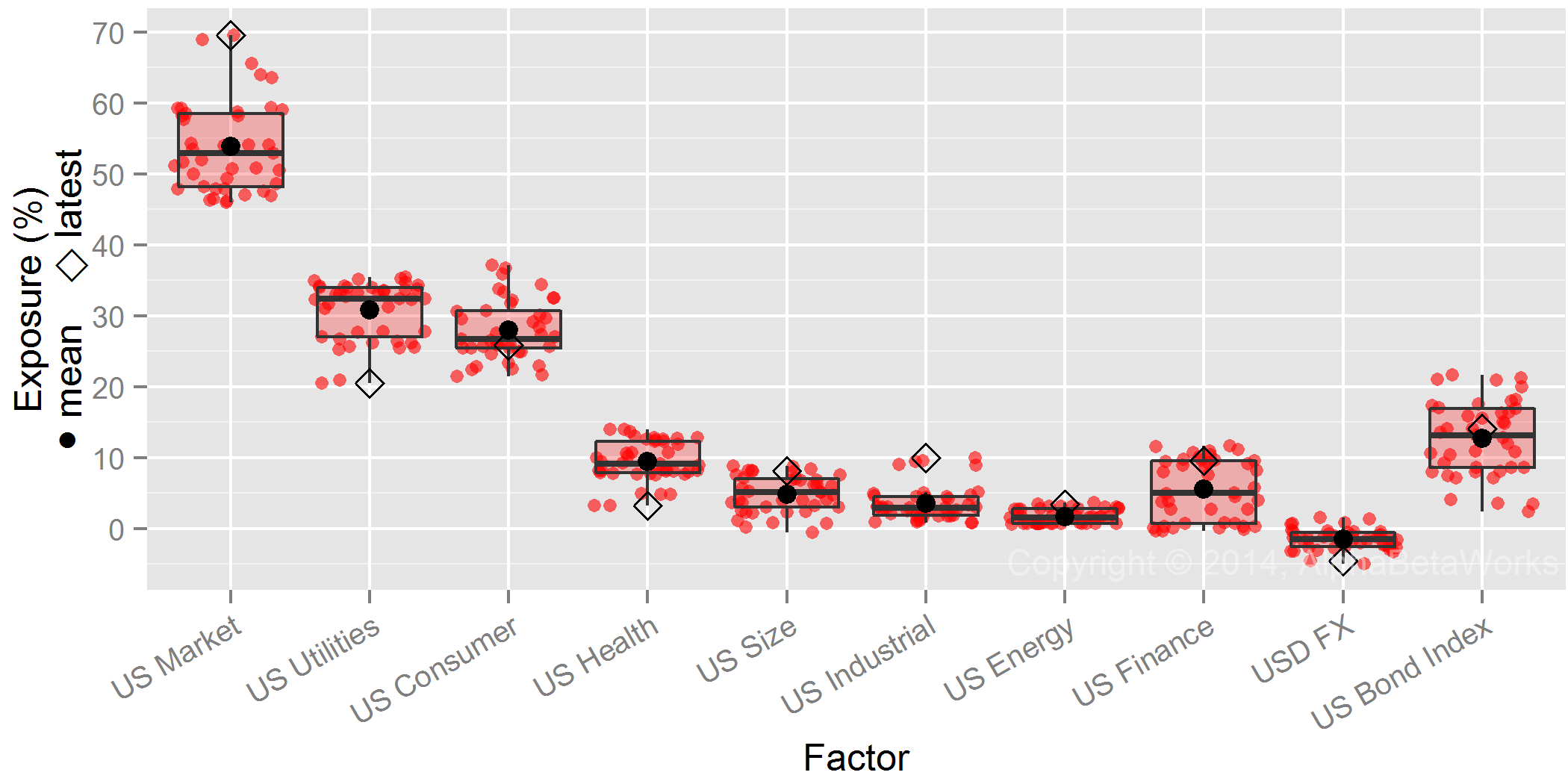
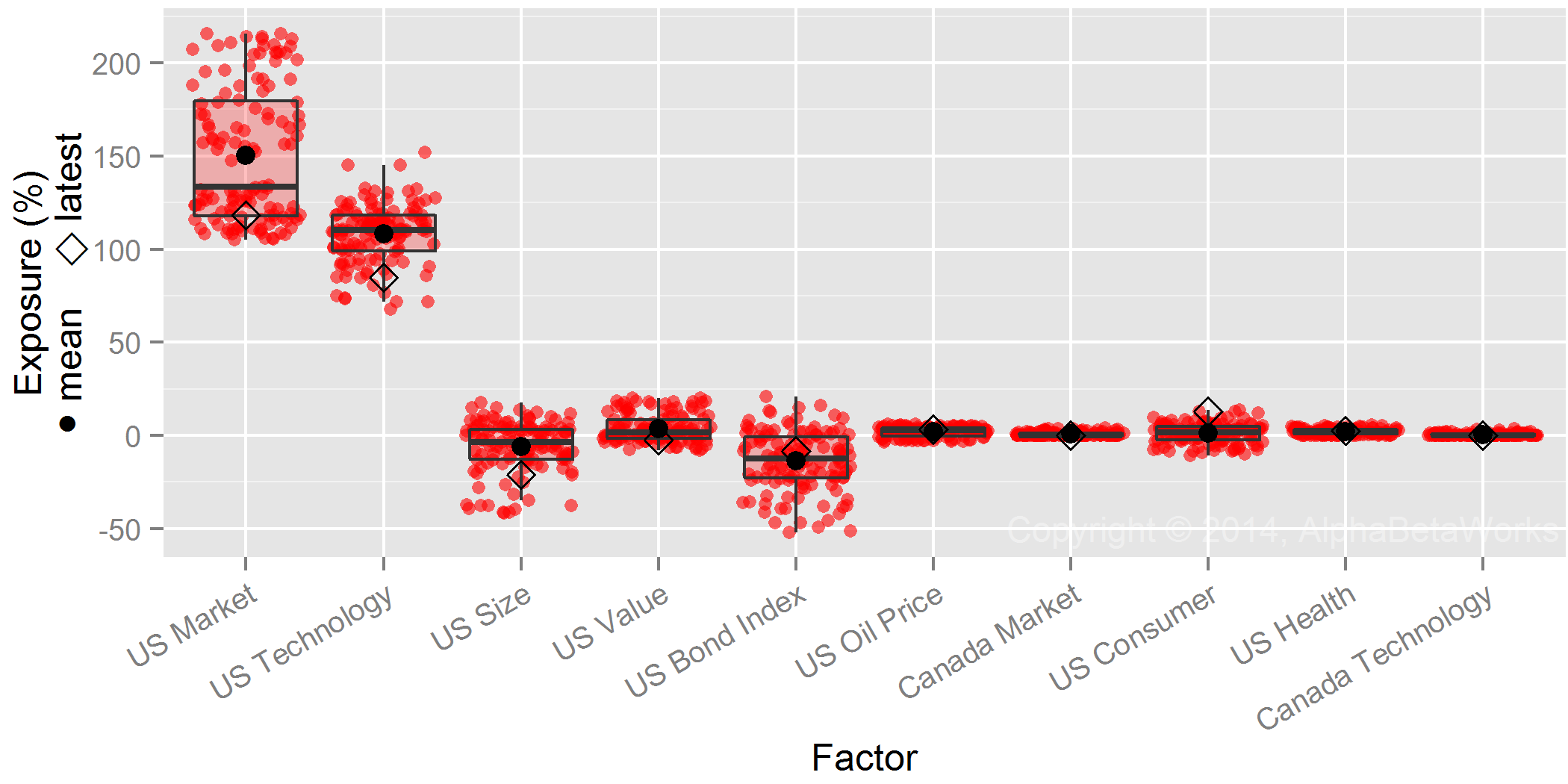
Property and Casualty Industry Year-end 2013 Crowding
Property and casualty industry’s recent crowding has been costly in practice. P&C Aggregate’s relative factor bets have cost it over 4% since year-end 2013. The industry made $12 billion less than it would have if it had simply matched market factor exposures.
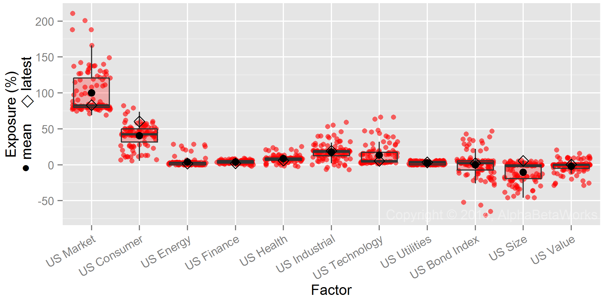
Year-end 2013 Systematic (Factor) Exposures
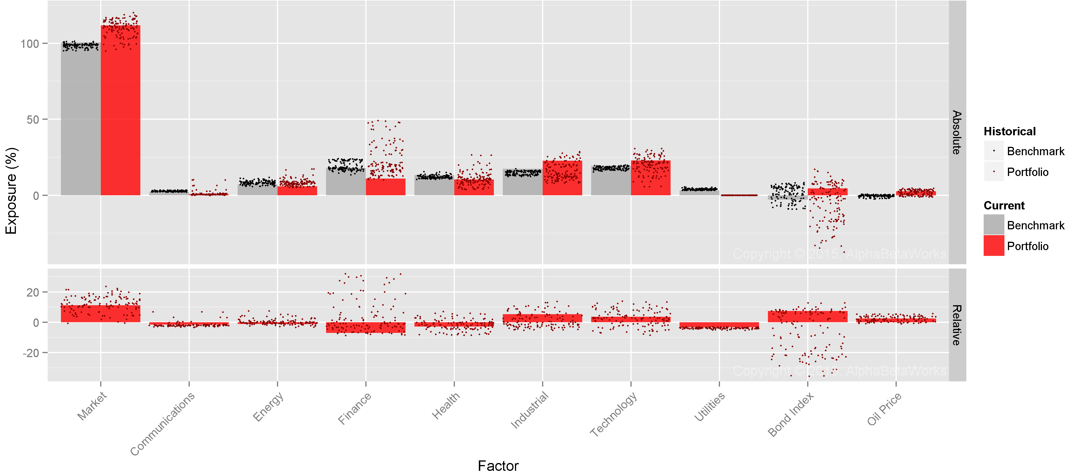
Below are P&C Aggregate’s most significant factor exposures (Portfolio in red) relative to Russell 3000 (Benchmark in gray) as of 12/31/2013:

Factors Contributing Most to the Relative Portfolio Risk for Property and Casualty Industry Aggregate on 12/31/2013
P&C Aggregate’s factor exposures drive its systematic returns in various scenarios. The exposures above (underweight Market and Technology factors) suggest the P&C industry is preparing for technology crash akin to 2001. This and other historical regimes provide the stress tests below, similar to those now required of numerous managers.
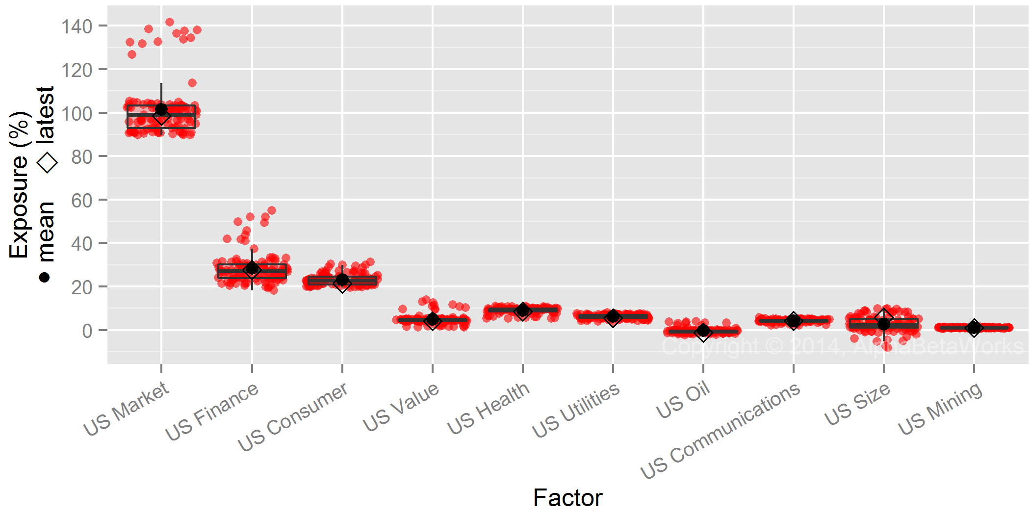
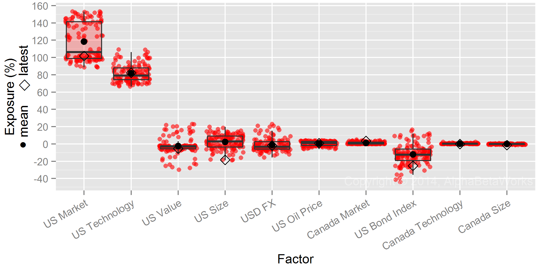
Property and Casualty Industry Year-end 2014 Crowding
Year-end 2014 Systematic (Factor) Exposures
Property and casualty industry portfolio turnover is low. Consequently, industry factor exposures at year-end 2014 were close to those at year-end 2013. Below are P&C Aggregate’s most significant factor exposures (Portfolio in red) relative to Russell 3000 (Benchmark in gray) as of 12/31/2014:

Factors Contributing Most to the Relative Portfolio Risk for Property and Casualty Industry Aggregate on 12/31/2014
The main exposures of the property and casualty industry were: short/underweight Market (Beta), long/overweight Size (large companies), short Health, and short Technology. The industry crowds towards large and low-beta Consumer and Financials stocks:
| Factor |
Portfolio Exposure |
Benchmark Exposure | Relative Exposure | Factor Volatility | Share of Absolute Factor Variance | Share of Absolute Total Variance | Share of Relative Factor Variance |
Share of Relative Total Variance |
| Market |
90.39 |
99.97 | -9.58 | 13.44 | 98.18 | 96.21 | 55.19 |
26.60 |
| Size |
13.32 |
-1.01 | 14.33 | 8.03 | -0.91 | -0.90 | 46.71 |
22.51 |
| Health |
7.68 |
13.09 | -5.41 | 6.91 | 0.29 | 0.28 | 6.19 |
2.98 |
| Technology |
9.31 |
19.10 | -9.79 | 5.80 | -0.06 | -0.06 | 4.16 |
2.00 |
| Mining |
1.54 |
0.63 | 0.91 | 15.61 | -0.20 | -0.19 | 1.76 |
0.85 |
| Energy |
3.93 |
5.67 | -1.74 | 10.47 | 1.04 | 1.02 | 1.62 |
0.78 |
| Consumer |
27.11 |
23.04 | 4.08 | 3.91 | -0.68 | -0.66 | 1.53 |
0.74 |
| Finance |
21.48 |
18.92 | 2.56 | 5.48 | -1.93 | -1.89 | 1.49 |
0.72 |
| Value |
1.52 |
0.78 | 0.73 | 13.45 | -0.04 | -0.04 | 0.61 |
0.29 |
Scenario Analysis: 2000-2001 Outperformance
Given property and casualty industry’s under-weighting of Market and Technology, it would experience its highest outperformance in an environment similar to the 2001 technology crash. In this environment, industry’s systematic exposures would generate 2% outperformance:
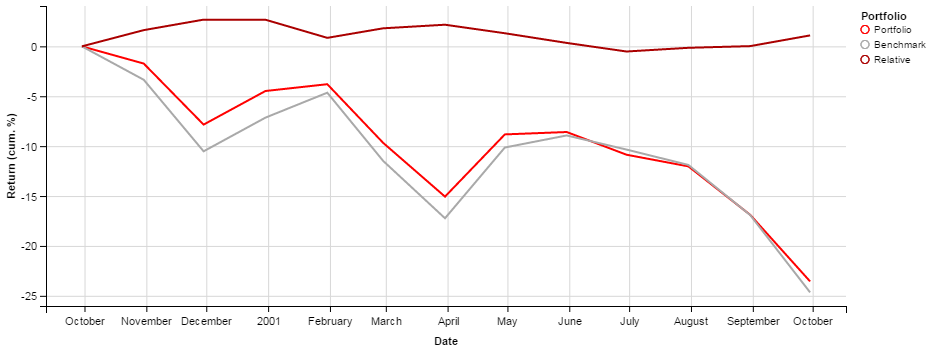
2000-2001: Stress test of outperformance due to Property and Casualty Industry’s Portfolio Factor Exposures
Below are the main contributors to this outperformance, in percent:
| Factor | Return | Portfolio Exposure | Benchmark Exposure | Relative Exposure | Portfolio Return | Benchmark Return | Relative Return |
| Technology |
-36.83 |
9.31 | 19.10 | -9.79 | -3.96 | -7.99 |
4.04 |
| Market |
-29.28 |
90.39 | 99.97 | -9.58 | -26.75 | -29.27 |
2.52 |
| Consumer |
19.60 |
27.11 | 23.04 | 4.08 | 5.03 | 4.26 |
0.77 |
| Finance |
27.27 |
21.48 | 18.92 | 2.56 | 5.48 | 4.81 |
0.66 |
| Value |
42.82 |
1.52 | 0.78 | 0.73 | 0.58 | 0.30 |
0.28 |
| Mining |
32.25 |
1.54 | 0.63 | 0.91 | 0.47 | 0.20 |
0.28 |
Scenario Analysis: 1999-2000 Underperformance
Given property and casualty industry’s under-weighting of Market and Technology, it would experience its highest underperformance in an environment similar to the 1999 technology boom. In this environment, industry’s systematic exposures would underperform the market by more than 10%:
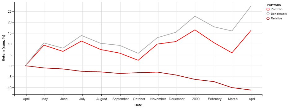
1999-2000: Stress test of underperformance due to Property and Casualty Industry’s Portfolio Factor Exposures
Below are the main contributors to this underperformance, in percent:
| Factor |
Return |
Portfolio Exposure | Benchmark Exposure | Relative Exposure | Portfolio Return | Benchmark Return |
Relative Return |
| Technology |
53.04 |
9.31 | 19.10 | -9.79 | 4.30 | 8.95 |
-4.66 |
| Market |
29.23 |
90.39 | 99.97 | -9.58 | 26.22 | 29.22 |
-3.00 |
| Size |
-18.83 |
13.32 | -1.01 | 14.33 | -2.63 | 0.20 |
-2.83 |
| Consumer |
-16.57 |
27.11 | 23.04 | 4.08 | -4.72 | -4.02 |
-0.70 |
| Finance |
-20.59 |
21.48 | 18.92 | 2.56 | -4.54 | -4.01 |
-0.54 |
| Energy |
14.38 |
3.93 | 5.67 | -1.74 | 0.62 | 0.90 |
-0.27 |
| FX |
6.84 |
-3.74 | -1.19 | -2.55 | -0.25 | -0.08 |
-0.17 |
| Value |
-14.04 |
1.52 | 0.78 | 0.73 | -0.17 | -0.09 |
-0.08 |
| Mining |
-8.54 |
1.54 | 0.63 | 0.91 | -0.08 | -0.03 |
-0.05 |
| Communications |
0.52 |
1.30 | 2.06 | -0.76 | 0.02 | 0.04 |
-0.01 |
Conclusions
- There is factor (systematic/market) crowding of property and casualty insurance companies’ long U.S. equity portfolios.
- The main sources of systematic crowding are short (underweight) exposures to Market (Beta), Technology, and Health.
- Since year-end 2013, factor exposures have cost the property and casualty industry over 4%, more than $12 billion, in underperformance.
- For some portfolios, this may be a conscious risk management decision; for others, it is a costly oversight.
- By managing its exposures in recent quarters, the industry would have generated billions in additional returns.