Category Archives: Mutual Funds

The Predictive Power of Active Share

Active Share is a popular metric that purports to measure portfolio activity. Though Active Share’s fragility and ease of manipulation are increasingly well-understood, there has been no research on its predictive power. This paper quantifies the predictive power of Active Share and finds that, though Active Share is a statistically significant predictor of the performance difference between portfolio and benchmark (there is a relationship between Active Share and how active a fund is relative to a given benchmark), it is a weak one. The relationship explains only about 5% of the variation in activity across U.S. equity mutual funds. The predictive power of Active Share is a small fraction of that achieved with robust and predictive equity risk models.

The Breakdown of Active Share

Active Share — the absolute percentage difference between portfolio and benchmark holdings – is a common metric of fund activity. The flaws of this measure are evident from some simple examples:

  • If a fund with S&P 500 benchmark buys SPXL (S&P 500 Bull 3x ETF), it becomes more passive and more similar to its benchmark, yet its Active Share increases.
  • If a fund uses the S&P 500 as its benchmark but indexes Russell 2000, it is passive, yet its Active Share is 100%.
  • If a fund differs from a benchmark by a single 5% position with 20% residual (idiosyncratic, stock-specific) volatility, and another fund differs from the benchmark by a single 10% position with 5% residual volatility, the second fund is less active, yet it has a higher Active Share.
  • If a fund holds a secondary listing of a benchmark holding that tracks the primary holding exactly, it becomes no more active, yet its Active Share increases.

Given the flows above, the evidence that Active Share funds that outperform may merely index higher-risk benchmarks is unsurprising.

Measuring Active Management

A common defense is that these criticisms are pathological or esoteric, and unrepresentative of the actual portfolios. Such defense asserts that Active Share measures active management of real-world portfolios.

Astonishingly, we have not seen a single paper assess whether Active Share has any effectiveness in doing what it is supposed to do – identify which funds are more and which are less active. This paper provides such an assessment.

We consider two metrics of fund activity: Tracking Error and monthly active returns (measured as Mean Absolute Difference between portfolio and benchmark returns). Both these metrics measure how different the portfolios are in practice. Whether Active Share measures actual fund activity depends on whether it can differentiate among more and less active funds. 

The study dataset comprises portfolio histories of approximately 3,000 U.S. equity mutual funds that are analyzable from regulatory filings. The funds all had 2-10 years of history. Our study uses the bootstrapping statistical technique – we select 10,000 samples and perform the following steps for each sample:

  • Select a random fund F and a random date D.
  • Calculate Active Share of F to the S&P 500 ETF (SPY) at D.
  • Keep only those samples with Active Share between 0 and 0.75. This filter ensures that SPY may be an appropriate benchmark, and excludes small- and mid-capitalization funds that share no holdings with SPY. Such funds would all collapse into a single point with Active Share of 100, impairing statistical analysis.
  • Measure the activity of F for the following 12 months (period D to D + 12 months). We determine how active a fund is relative to a benchmark by quantifying how similar its performance is to that of the benchmark.

After the above steps, we have 10,000 observations of fund activity as estimated by Active Share versus the funds’ actual activity for the subsequent 12 months.

The Predictive Power of Active Share for U.S. Equity Mutual Funds

The following results quantify the predictive power of Active Share to differentiate among more and less active U.S. equity mutual funds. For perspective, we also include results on the predictive power of robust equity risk models. These results illustrate the relative weakness of Active Share as a measure of fund activity. They also indicate that, far from mitigating legal risk by reliance upon a claimed “best practice,” the use of Active Share to detect closet indexing may instead create legal risk.

The Predictive Power of Active Share to Forecast Future Tracking Error

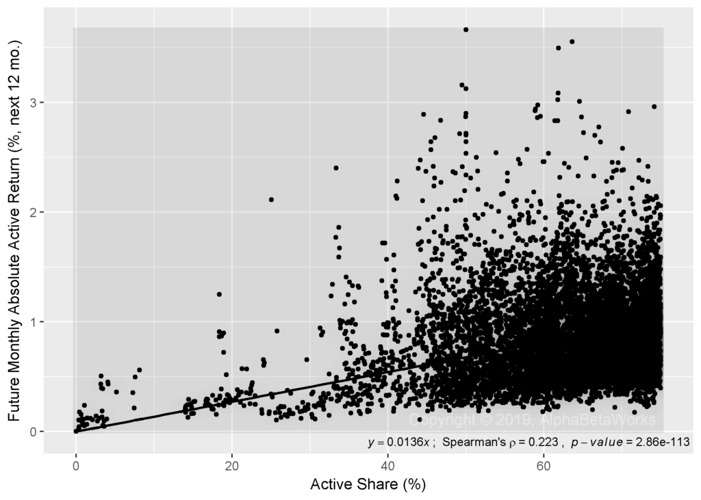
Although Active Share is a statistically significant metric of fund activity, it is a weak one. Active Share predicts only about 5% of the variation in tracking error across mutual funds:

Chart of the predictive power of Active Share to forecast future tracking error of U.S. equity mutual funds illustrating a weak predictive power.
U.S. Equity Mutual Fund Portfolios: The Predictive Power of Active Share to Forecast Future Tracking Error
Residual standard error: 1.702 on 9998 degrees of freedom
Multiple R-squared:  0.05163,   Adjusted R-squared:  0.05154
F-statistic: 544.3 on 1 and 9998 DF,  p-value: < 2.2e-16

The distributions clearly suffer from heteroscedasticity, which can invalidate tests of statistical significance. To control for this, we also consider the relationship between the rankings of Active Share and future tracking errors. This alternative approach does not affect the results:

Chart of the predictive power of Active Share to forecast future tracking error rank of U.S. equity mutual funds illustrating a weak predictive power.
U.S. Equity Mutual Fund Portfolios: The Predictive Power of Active Share to Forecast Future Tracking Error Rank
Residual standard error: 2811 on 9998 degrees of freedom
Multiple R-squared:  0.05226,   Adjusted R-squared:  0.05217
F-statistic: 551.3 on 1 and 9998 DF,  p-value: < 2.2e-16

The Predictive Power of Active Share to Forecast Future Active Returns

Active Share also predicts approximately 5% of the variation in monthly absolute active returns across mutual funds:

Chart of the predictive power of Active Share to forecast monthly absolute active return of U.S. equity mutual funds illustrating a weak predictive power.
U.S. Equity Mutual Fund Portfolios: The Predictive Power of Active Share to Forecast Future Active Return
Residual standard error: 0.3986 on 9998 degrees of freedom
Multiple R-squared:  0.04999,   Adjusted R-squared:  0.04989
F-statistic: 526.1 on 1 and 9998 DF,  p-value: < 2.2e-16

The above results make a generous assumption that all relative returns are due to active management. In fact, much relative performance is attributable to passive differences between a portfolio and a benchmark. We will illustrate this complexity in our follow-up research.

The Predictive Power of Robust Equity Risk Models

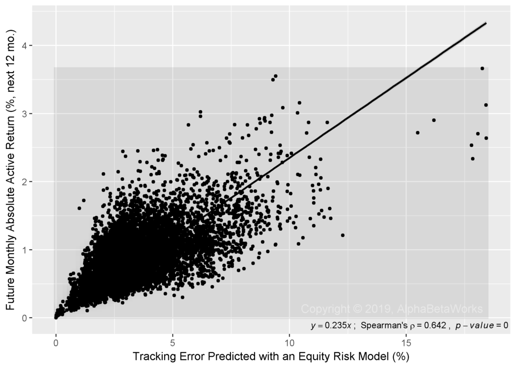
To put the predictive power of Active Share into perspective, we compare it to the predictive power of tracking error as estimated by robust and predictive equity risk models. Instead of Active Share, we use AlphaBetaWorks’ default Statistical U.S. Equity Risk Model to forecast tracking error of a fund F at date D.

The Predictive Power of Equity Risk Models to Forecast Future Tracking Error

The equity risk model predicts approximately 38% of the variation in tracking error across mutual funds:

Chart of the predictive power of robust equity risk models to forecast future tracking error of U.S. equity mutual funds illustrating a strong predictive power.
U.S. Equity Mutual Fund Portfolios: The Predictive Power of Robust Equity Risk Models to Forecast Future Tracking Error
Residual standard error: 1.379 on 9998 degrees of freedom
Multiple R-squared: 0.3776, Adjusted R-squared: 0.3776
F-statistic: 6067 on 1 and 9998 DF, p-value: < 2.2e-16

As with Active Share above, heteroscedasticity does not affect the results. We see a similar relationship when we consider ranks instead of values:

Chart of the predictive power of robust equity risk models to forecast future tracking error rank of U.S. equity mutual funds illustrating a strong predictive power.
U.S. Equity Mutual Fund Portfolios: The Predictive Power of Robust Equity Risk Models to Forecast Future Tracking Error Rank
Residual standard error: 2278 on 9998 degrees of freedom
Multiple R-squared: 0.3773, Adjusted R-squared: 0.3772
F-statistic: 6058 on 1 and 9998 DF, p-value: < 2.2e-16

The Predictive Power of Equity Risk Models to Forecast Future Active Returns

The equity risk model predicts approximately 44% of the variation in monthly absolute active returns across mutual funds:

Chart of the predictive power of robust equity risk models to forecast monthly absolute active return of U.S. equity mutual funds illustrating a strong predictive power.
U.S. Equity Mutual Fund Portfolios: The Predictive Power of Robust Equity Risk Models to Forecast Future Active Return
Residual standard error: 0.3068 on 9998 degrees of freedom
Multiple R-squared: 0.4375, Adjusted R-squared: 0.4374
F-statistic: 7776 on 1 and 9998 DF, p-value: < 2.2e-16

Conclusions

  • Active Share is a statistically significant metric of active management (there is a relationship between Active Share and how active a fund is relative to a given benchmark), but the predictive power of Active Share is very weak.
  • Active Share predicts approximately 5% of the variation in tracking error and active returns across U.S. equity mutual funds. 
  • A robust and predictive equity risk model is roughly 7-9-times more effective than Active Share, predicting approximately 40% of the variation in tracking error and active returns across U.S. equity mutual funds.
  • In the following articles, we will put the above predictive statistics into context and quantify how likely Active Share is to identify closet indexers.

The information herein is not represented or warranted to be accurate, correct, complete or timely. Past performance is no guarantee of future results. Copyright © 2012-2019, AlphaBetaWorks, a division of Alpha Beta Analytics, LLC. All rights reserved. Content may not be republished without express written consent.


Performance of the Top U.S. Stock Pickers in 2016

And What They Owned at Year-end

Though 2016 was a poor year for most institutional portfolio managers, it was a satisfactory year for the most skilled ones. Security selection returns of the top U.S. stock pickers in 2016 were positive. When hedged to match market risk, a consensus portfolio of the top intuitional U.S. stock pickers outperformed the Market by approximately 2%.

This article demonstrates how a robust equity risk model and predictive performance analytics identify the top stock pickers – the hard part of measuring investment skill. Since genuine investment skill persists, the top stock pickers of the past tend to generate positive stock picking returns in the future. We illustrate this performance and share the top consensus positions driving it. These consensus positions of the top U.S. stock pickers are a profitable resource for investors searching for ideas. The method for tracking the top active managers and this method’s performance are benchmarks against which capital allocators can evaluate qualitative and quantitative manager selection processes.

Identifying the Top U.S. Stock Pickers

This study updates our analysis for 2015 and follows a similar method:  We analyzed long U.S. equity portfolios of all institutions that have filed Forms 13F. This survivorship-free portfolio database comprises thousands of firms. The database covers all institutions that have managed over $100 million in long U.S. assets. Some of these firms were not suitable for skill evaluation, for instance due to short filings histories or high turnover. Approximately 4,000 firms were evaluated.

During bullish market regimes, the top-performing portfolios are those that take the most factor (systematic) risk. During bearish market regimes, the top-performing portfolios are those that take the least risk. Hence, when the regimes change the leaders revert. This is the main reason nominal returns and related simplistic metrics of investment skill (Sharpe Ratio, Win/Loss Ratio, etc.) revert and fail. This is also the evidence behind most purported proofs of the futility of active manager selection. These arguments assume that, since the flawed performance metrics are non-predictive, all performance metrics are non-predictive, and it is impossible to identify future outperformers.

To eliminate the systematic noise that is the source of performance reversion, the AlphaBetaWorks Performance Analytics Platform calculates portfolio return from security selection – αReturn. αReturn is the performance a portfolio would have generated if all factor returns had been flat. This is the estimated residual performance due to stock picking skill, net of all factor effects. Each month we identify the top five percent among 13F-filers with the most consistently positive αReturns over the prior 36 months. This expert panel of the top stock pickers typically includes 100-150 firms. Data is lagged 2 months to account for the filing delay. We construct the aggregate expert portfolio (the ABW Expert Aggregate) by equal-weighting the expert portfolios and position-weighting stocks within the expert portfolios.

Manager fame and firm size are poor proxies for skill. Consequently, the ABW Expert Aggregate is an eclectic collection that includes hedge funds and asset management firms, banks, endowments, trust companies, and other institutions.

Market-Neutral Performance of the Top U.S. Stock Pickers

Since security selection skill persists, portfolios that have generated positive αReturns in the past are likely to generate them in the future. Consequently, a hedged aggregate of such portfolios (the Market-Neutral ABW Expert Aggregate) delivers consistent positive returns:

Chart of the cumulative return of the Market (Russell 3000) and the cumulative return of the market-neutral portfolio that combines the to 5% U.S. institutional long stock pickers net consensus exposures

Cumulative Market-Neutral Portfolio Return: Top U.S. Stock Pickers’ Net Consensus Longs

2005 2006 2007 2008 2009 2010 2011 2012 2013 2014 2015 2016
Market-Neutral
ABW Expert Aggregate
4.15 14.43 12.74 5.95 -1.25 15.35 2.20 2.24 15.47 8.81 13.16 1.72
iShares Russell
3000 ETF
6.08 15.65 4.57 -37.16 28.21 16.81 0.78 16.43 32.97 12.41 0.34 12.61

ABW Expert Aggregate outperformed the broad market with less than half the volatility:

Market-Neutral
ABW Expert Aggregate
iShares Russell 3000 ETF
Annualized Return 7.69 7.49
Annualized Standard Deviation 5.29 14.71
Annualized Sharpe Ratio (Rf=0%) 1.45 0.51

There are several ways to reconcile the positive stock picking performance above with the apparently challenging environment for fundamental stock picking in 2016:

  • Performance of an average manager is a poor proxy for the performance of a top manager.
  • Some skilled managers may suffer from underdeveloped risk systems, and losses from hidden systematic risks conceal their stock-picking results.
  • Many skilled stock pickers are poor market timers, or they may have experienced a challenging market-timing environment.

ABW Expert Aggregate is different than the crowded portfolios, which we have written about at length. Whereas crowded bets are shared by the entire universe of investors, ABW Expert Aggregate is a small subset covering the consistently best stock pickers. It is common for crowded hedge fund longs (overweights) to be shorts (underweights) of ABW Expert Aggregate, and vice versa.

Market Performance of the Top U.S. Stock Pickers

The Market-Neutral ABW Expert Aggregate is fully hedged. Accordingly, it has insignificant market exposure and will, by definition, underperform the Market during the bullish regimes. Therefore, the Market-Neutral ABW Expert Aggregate is not suitable as a core holding and is not directly comparable to long portfolios.

The aggregate portfolio of the top stock pickers can be hedged to match the market risk. This portfolio (the Market-Risk ABW Expert Aggregate) delivers consistent outperformance, instead of the consistent absolute returns of the Market-Neutral ABW Expert Aggregate:

Chart of the cumulative return of the Market (Russell 3000) and the cumulative return of the portfolio with market risk that combines the to 5% U.S. institutional long stock pickers net consensus exposures

Cumulative Market-Risk Portfolio Return: Top U.S. Stock Pickers’ Net Consensus Longs

2005 2006 2007 2008 2009 2010 2011 2012 2013 2014 2015 2016
Market-Risk
ABW Expert Aggregate
10.43 32.20 17.32 -33.79 26.43 34.52 2.78 19.15 52.93 22.07 13.10 14.77
iShares Russell
3000 ETF
6.08 15.65 4.57 -37.16 28.21 16.81 0.78 16.43 32.97 12.41 0.34 12.61


Market-Risk
ABW Expert Aggregate
iShares Russell 3000 ETF
Annualized Return 15.53 7.49
Annualized Standard Deviation 16.57 14.71
Annualized Sharpe Ratio (Rf=0%) 0.94 0.51

Top U.S. Stock Pickers’ Consensus Positions

Just as few celebrated firms were the top U.S. stock pickers in 2016, few celebrated stocks were their top ideas. Below are the top 10 consensus overweights of the ABW Expert Aggregate at year-end 2016:

Symbol Name Exposure (%)
EA Electronic Arts Inc. 1.41
NTES NetEase, Inc. 1.00
OXY Occidental Petroleum Corporation 0.69
PXD Pioneer Natural Resources 0.68
PEP PepsiCo, Inc. 0.63
SCHW Charles Schwab Corporation 0.55
ACN Accenture Plc 0.52
JNJ Johnson & Johnson 0.48
NKE NIKE, Inc. 0.46
V Visa Inc. 0.44

Many of these positions remained since year-end 2015, illustrating the stability of the ABW Expert Aggregate.

Top Stock Pickers’ Exposure to Electronic Arts (EA)

The top panel on the following chart shows EA’s cumulative nominal return in black and cumulative residual return (αReturn) in blue. Recall that residual return or αReturn is the performance EA would have generated if all factor returns had been zero. The bottom panel shows exposure to EA within the ABW Expert Aggregate. Top stock pickers had negligible exposure to EA until 2015. In early-2015 EA became one of the largest exposures within the Expert Aggregate, and it remained a top position through 2016:

Chart of the cumulative αReturn (residual return) of EA and exposure to EA within the hedged portfolio that combines the to 5% U.S. long stock pickers net consensus exposures

Cumulative αReturns of EA and Exposure to EA within the Hedged Portfolio of the Top U.S. Stock Pickers’ Net Consensus Longs

Top Stock Pickers’ Exposure to NetEase (NTES)

ABW Expert Aggregate had negligible exposure to NTES until early 2016. NTES became a consensus long by early-2016. The strong positive αReturn of NTES continued through 2016:

Chart of the cumulative αReturn (residual return) of NTES and exposure to NTES within the hedged portfolio that combines the to 5% U.S. long stock pickers net consensus exposures

Cumulative αReturns of NTES and Exposure to NTES within the Hedged Portfolio of the Top U.S. Stock Pickers’ Net Consensus Longs

Top Stock Pickers’ Exposure to Occidental Petroleum (OXY)

The Aggregate was mostly underweight (short) OXY between 2010 and 2016. This means that the top U.S. stock pickers were underweight the stock. Their exposure to OXY grew through 2016 and by year-end it was a top bet. The smart money has added to OXY in 2016 even as it underperformed:

Chart of the cumulative αReturn (residual return) of NTES and exposure to NTES within the hedged portfolio that combines the to 5% U.S. long stock pickers net consensus exposures

Cumulative αReturns of OXY and Exposure to OXY within the Hedged Portfolio of the Top U.S. Stock Pickers’ Net Consensus Longs

Conclusions

  • Robust equity risk models and predictive performance analytics can identify the top stock pickers in the sea of mediocrity.
  • The market-neutral aggregate of the top stock pickers’ portfolios delivers consistent absolute performance.
  • The aggregate of the top stock pickers’ portfolios matching market risk delivers consistent outperformance relative to the Market.
  • Consensus portfolio of the top stock pickers is a profitable source of investment ideas.
  • Provided they control properly for systematic (factor) effects, simple rules for manager selection tend to select future outperformers.
The information herein is not represented or warranted to be accurate, correct, complete or timely.
Past performance is no guarantee of future results.
Copyright © 2012-2017, AlphaBetaWorks, a division of Alpha Beta Analytics, LLC. All rights reserved.
Content may not be republished without express written consent.
U.S. Patents Pending.

Performance Persistence within International Style Boxes

We earlier discussed how nominal returns and related investment performance metrics revert: Since portfolio performance primarily comes from systematic (factor) exposures, such simplistic metrics merely promote the high-risk portfolios during the bullish regimes and the low-risk portfolios during the bearish regimes. As regimes change, the leaders flip. We also showed that, when security selection returns are distilled with a robust factor model, performance persists within all U.S. equity Style Boxes. Prompted by reader interest, we now investigate performance persistence within International Style Boxes.

Measuring the Persistence of International Portfolio Returns

As in our earlier work on return persistence, we examine all Form 13F filings for the past 10 years. This survivorship-free portfolio database covers all institutions that exercised investment discretion over at least $100 million and yields approximately 3,600 international portfolios with sufficiently long histories, low turnover, and broad positions to be suitable for the study.

We split the 10 years of history into two random 5-year samples and compared performance metrics of each portfolio over these two periods. The correlation between metrics over the sample periods measures the metrics’ persistence.

International Portfolios’ Performance Persistence

The Reversion of International Portfolios’ Nominal Returns

The following chart plots the rankings of each portfolio’s nominal returns during the two sample periods. The x-axis plots return percentile, or ranking, in the first sample period. The y-axis plots return percentile, or ranking, in the second sample period. The best-performing international portfolios of the first period have x-values near 100; the best-performing portfolios of the second period have y-values near 100:

Chart of the random relationship between nominal returns for two historical samples for all international equity 13F portfolios

13F Portfolios, International Positions: Correlation between the rankings of nominal returns for two historical samples

Whereas past performance of U.S. equity portfolios was a (negative) predictor of future results, there is no significant correlation between the two for international portfolios – best- and worst-performers tend to become average.

The Persistence of International Portfolios’ Security Selection Returns

Due to the domineering effects of Market and other systematic factors, top-performing managers during the bullish regimes are those that take the most risk, and top-performing managers during the bearish regimes are those that take the least risk. Since Market returns are approximately random, nominal returns do not persist. To eliminate this noise, the AlphaBetaWorks Performance Analytics Platform calculates each portfolio’s return from security selection net of factor effects. αReturn is the return a manager would have generated if all factor returns had been flat.

International portfolios with above-average αReturns in one period are likely to maintain them in the other. In the following chart, this relationship is represented by the concentration of portfolios in the bottom left (laggards that remained laggards) and top right (leaders that remained leaders):

Chart of the positive correlation between risk-adjusted returns from security selection (αReturns) for two historical samples for all international equity 13F portfolios

13F Portfolios, International Positions: Correlation between the rankings of αReturns for two historical samples

This test of persistence across two arbitrary 5-year samples is strict. Persistence of security selection skill is even higher over shorter periods.

Performance Persistence within International Style Boxes

Measures of investment style such as Size (portfolio market capitalization) and Value/Growth (portfolio valuation) are common approaches to grouping portfolios. Readers frequently ask whether the reversion of nominal returns and related metrics can be explained by Style Box membership. Perhaps we merely observed reversion in leadership that is eliminated by controlling for Style?

To test this, we compared performance persistence within each of the four popular Style Boxes.

International Large-Cap Value Portfolios’ Performance Persistence

The International Large-cap Value Style Box shows the highest persistence of long-term stock picking results, yet the relationship between nominal returns within it is still nearly random. Powerful performance analytics provide the biggest edge for this International Style Box:

Chart of the random relationship between nominal returns and positive correlation between risk-adjusted returns from security selection (αReturns) for two historical samples for equity 13F portfolios in the Large-Cap Value International Style Box

Large-Cap Value 13F Portfolios, International Positions: Correlation between the rankings of nominal returns αReturns for two historical samples

International equity portfolios differ from U.S. equity portfolios, where security selection persistence was highest for the Small-cap Value Style Box.

International Large-Cap Growth Portfolios’ Performance Persistence

International portfolios in the Large-cap Growth Style Box also show a nearly random relationship between the two periods’ returns. However, their αReturns persist strongly. Whereas large-cap growth stock picking is treacherous for U.S. equity portfolios, it is more rewarding internationally:

Chart of the random relationship between nominal returns and positive correlation between risk-adjusted returns from security selection (αReturns) for two historical samples for equity 13F portfolios in the Large-Cap Growth International Style Box

Large-Cap Growth 13F Portfolios, International Positions: Correlation between the rankings of nominal returns αReturns for two historical samples

International Small-Cap Value Portfolios’ Performance Persistence

International portfolios in the Small-cap Value Style Box have the least persistent αReturns, in contrast to the U.S. portfolios:

Chart of the random relationship between nominal returns and positive correlation between risk-adjusted returns from security selection (αReturns) for two historical samples for equity 13F portfolios in the Small-Cap Value International Style Box

Small-Cap Value 13F Portfolios, International Positions: Correlation between the rankings of nominal returns αReturns for two historical samples

International Small-Cap Growth Portfolios’ Performance Persistence

αReturns within the International Small-cap Growth Style Box persist almost as strongly as within the International Large-cap Style Boxes:

Chart of the random relationship between nominal returns and positive correlation between risk-adjusted returns from security selection (αReturns) for two historical samples for equity 13F portfolios in the Small-Cap Growth International Style Box

Small-Cap Growth 13F Portfolios, International Positions: Correlation between the rankings of nominal returns αReturns for two historical samples

Summary

  • Whereas nominal returns and related simplistic metrics of investment skill revert, security selection performance – once properly distilled with a capable factor model – persists.
  • The randomness and reversion of nominal returns and the persistence of security selection skill hold across all International Style Boxes.
  • Security selection performance persists most strongly for International Large-cap portfolios.
The information herein is not represented or warranted to be accurate, correct, complete or timely.
Past performance is no guarantee of future results.
Copyright © 2012-2016, AlphaBetaWorks, a division of Alpha Beta Analytics, LLC. All rights reserved.
Content may not be republished without express written consent.

Performance Persistence within Style Boxes

Common approaches to manager selection do a lousy job since nominal returns and similar simplistic metrics of investment performance revert: Most portfolio performance comes from systematic (factor) exposures, and such metrics merely identify the highest-risk portfolios during the bullish regimes and the lowest-risk portfolios during the bearish regimes. As regimes change, so do the leaders. In the past we demonstrated the reversion of mutual funds’ nominal returns, the reversion of hedge funds’ nominal returns, and the failures of popular statistics (Sharpe Ratio, Win/Loss Ratio, etc.) based on nominal returns. This article extends the study of performance persistence to the broadest universe of U.S. institutional portfolios and to the popular Size and Value/Growth style boxes within this universe.

Our earlier work also showed that, when security selection returns are properly calculated with a robust factor model, skill persists – portfolios of the top stock pickers of the past outperform market and peers in the future. We will now validate these findings across all major style boxes and note the particular effectiveness of predictive skill analytics for small-cap manager selection.

Measuring Persistence of Returns

We surveyed portfolios of over 5,000 institutions that have filed Form 13F in the past 10 years. This is the broadest and most representative survivorship-free portfolio database for all institutions that exercised investment discretion over at least $100 million. The collection includes hedge funds, mutual fund companies, and investment advisors. Approximately 3,000 institutions had sufficiently long histories, low turnover, and broad portfolios to be suitable for this study of performance persistence.

We split the 10 years of history into two random 5-year subsets and compared performance of each portfolio over these two periods. If performance persists over time, there will be a positive correlation between returns in one period and returns in the other.

Performance Persistence for all Institutional Portfolios

The Reversion of Nominal Returns

The chart below plots the ranking of nominal returns for each portfolio during the two periods. Each point corresponds to a single institution. The x-axis plots return percentile, or ranking, in the first historical sample. The y-axis plots return percentile, or ranking, in the second historical sample. For illustration, the best-performing filers of the first period have x-values near 100; the best-performing filers of the second period have y-values near 100:

Performance persistence for nominal returns: Chart of the negative correlation of nominal returns over two historical samples for all U.S. equity 13F portfolios

13F Equity Portfolios: Correlation between the rankings of nominal returns for two historical samples

Contrary to a popular slogan, past performance actually is an indication of future results: Managers with above-average nominal returns in one historical sample are likely to have below-average nominal returns in the other. In the above chart, this negative relationship between (reversion of) historical returns is visible as groupings in the bottom right (leaders that became laggards) and top left (laggards that became leaders).

The Persistence of Security Selection Returns

Nominal performance reverts because it is dominated by Market and other systematic factors. Top-performing managers during the bullish regimes are those who take the most risk; top-performing managers during the bearish regimes are those who take the least risk. As regimes change, leadership flips. To eliminate these disruptive factor effects, the AlphaBetaWorks Performance Analytics Platform calculates each portfolio’s return from security selection net of factor effects. αReturn is the return a manager would have generated if all factor returns had been flat.

Managers with above-average αReturns in one period are likely to maintain them in the other. In the following chart, this positive relationship between historical αReturns is visible as grouping in the bottom left (laggards that remained laggards) and top right (leaders that remained leaders):

Performance persistence for security selection skill: Chart of the positive correlation of risk-adjusted returns from security selection (αReturns) over two historical samples for all U.S. equity 13F portfolios

13F Equity Portfolios: Correlation between the rankings of αReturns for two historical samples

A test of performance persistence across two arbitrary 5-year samples of a 10-year span is especially strict. For most funds covered by the Platform, persistence of security selection skill is far higher over shorter periods. It is highest for approximately 3 years and begins to fade rapidly after 4 years. The chart above also illustrates that low stock picking returns persist and do so more strongly than high stock picking returns – the bottom left cluster of consistently weak stock pickers is the most dense.

Performance Persistence within Each Style Box

Measures of investment style such as Size (average portfolio market capitalization) and Value/Growth are a popular approach to grouping portfolios and analyzing risk. Though not the dominant drivers of portfolio risk and performance, they are often believed to be. Consequently, clients frequently ask whether the reversion of nominal returns and related metrics can be explained by Style Box membership and cycles of style leadership. To test this, we compared performance persistence within each of the four popular style boxes. It turns out style does not explain nominal return reversion and αReturns persist within each style box.

Large-Cap Value Portfolio Return Persistence

Portfolios in the Large-cap Value Style Box show especially high nominal return reversion (-0.23 Spearman’s rank correlation coefficient between samples). This is probably attributable to the high exposures of these portfolios to the cyclical industries that suffer from the most pronounced booms and busts:

Performance persistence for Large-Cap Value 13F Portfolios: Chart of the negative correlation of nominal returns and positive correlation of risk-adjusted returns from security selection (αReturns) over two historical samples for U.S. equity 13F portfolios in the Large-Cap Value Style Box

Large-Cap Value 13F Portfolios: Correlation between the rankings of nominal returns and αReturns for two historical samples

Large-Cap Growth Portfolio Return Persistence

Portfolios in the Large-cap Growth Style Box are the closest to random and show the lowest persistence of αReturns. Large-cap Growth stock picking is exceptionally treacherous over the long term. While it is possible to select skilled managers in this area, it is challenging even with the most powerful skill analytics:

Performance persistence for Large-Cap Growth 13F Portfolios: Chart of the negative correlation of nominal returns and positive correlation of risk-adjusted returns from security selection (αReturns) over two historical samples for U.S. equity 13F portfolios in the Large-Cap Growth Style Box

Large-Cap Growth 13F Portfolios: Correlation between the rankings of nominal returns and αReturns for two historical samples

Small-Cap Value Portfolio Return Persistence

Portfolios in the Small-cap Value Style Box show nearly random nominal returns. They also have the most persistent αReturns. Small-cap Value stock picking records are thus most consistent over the long term. This is the area where allocators and investors armed with powerful skill analytics should perform well, especially by staying away from the unskilled managers:

Performance persistence for Small-Cap Value 13F Portfolios: Chart of the negative correlation of nominal returns and positive correlation of risk-adjusted returns from security selection (αReturns) over two historical samples for U.S. equity 13F portfolios in the Small-Cap Value Style Box

Small-Cap Value 13F Portfolios: Correlation between the rankings of nominal returns and αReturns for two historical samples

Small-Cap Growth Portfolio Return Persistence

Portfolios in the Small-cap Growth Style Box have the second most persistent αReturns. This is also an area where allocators and investors armed with powerful skill analytics will have a strong edge:

Performance persistence for Small-Cap Growth 13F Portfolios: Chart of the negative correlation of nominal returns and positive correlation of risk-adjusted returns from security selection (αReturns) over two historical samples for U.S. equity 13F portfolios in the Small-Cap Growth Style Box

Small-Cap Growth 13F Portfolios: Correlation between the rankings of nominal returns and αReturns for two historical samples

Summary

  • Nominal returns and related simplistic metrics of investment skill revert: as market regimes change, the top performers tend to become the bottom performers.
  • Security selection returns, when properly calculated with a robust factor model, persist and yield portfolios that outperform.
  • Both skill and lack of skill persist, and the lack of skill persists most strongly; while it is important that investors correctly identify the talented managers, it is even more important to divest from their opposites.
  • The reversion of nominal returns and the persistence of security selection skill hold across all style boxes, but security selection skill is most persistent for small-cap portfolios.
The information herein is not represented or warranted to be accurate, correct, complete or timely.
Past performance is no guarantee of future results.
Copyright © 2012-2016, AlphaBetaWorks, a division of Alpha Beta Analytics, LLC. All rights reserved.
Content may not be republished without express written consent.
U.S. Patents Pending.

The Risk Impact of Valeant on Sequoia Fund

“This is your fund on drugs”

The Sequoia Fund’s (SEQUX) hefty sizing of Valeant Pharmaceuticals (VRX) dramatically changed the fund’s risk profile from historical norms. With the proper tools, allocators would have noticed this style drift back in Q2 2015 when Sequoia’s key factor exposures moved two to three times beyond historical averages. What’s more, allocators would have noticed a predicted volatility increase of 25% and a tracking-error increased 70%. Though this analysis would not have anticipated Valeant’s subsequent decline, it would have warned fund investors that Sequoia’s risk was out of the ordinary.

Sequoia Fund’s Risk Profile

Below is a chart of Sequoia’s major factor exposures, spanning a ten year history through June 2015:

Chart of the exposures of Sequoia Fund (SEQUX) to the risk factors contributing most to its risk

Sequoia Fund (SEQUX) – Historical Factor Exposures

(Note that this analysis and our model do not include Valeant’s recent heightened volatility: we are using the AlphaBetaWorks Statistical Equity Risk Model as of 8/31/15 and SEQUX’s positions as of 6/30/2015. In short, we are looking at the world prior to Valeant’s subsequent downside volatility.)

Sequoia’s stock selection and allocation decisions result in certain factor bets such as market beta (“US and Canada”, above), other factors (Value, Size), and sectors (Consumer, Health). The red dots above represent factor exposures in a particular month, the red boxes represent two quartile deviations, and the diamonds denote current (i.e. 6/30/15) exposures. Several sectors/factors are circled for emphasis: they are current exposures as well as outliers versus history. More importantly, these outlying factor bets are the direct result of Sequoia’s large percentage ownership of Valeant.

The Impact of Valeant on Sequoia Fund’s Factor Exposures

We examined Sequoia Fund’s factor exposures with and without Valeant. We assumed that the pro forma Sequoia Fund without Valeant would have increased all other positions proportionally to make up for the void.  For example, we increase Sequoia’s next-largest position (TJX) from 7.3% to 10.9%, and so on for all longs for the pro forma non-Valeant Sequoia portfolio.

Below is a chart comparing the most salient factor exposures of Sequoia Fund, with and without Valeant:

Chart of the exposures of Sequoia Fund (SEQUX) to the risk factors contributing most to its risk including and excluding the position in Valeant (VRX)

Sequoia Fund (SEQUX) – Factor Exposures With and Without Valeant (VRX)

Valeant has had a significant impact on Sequoia’s factor exposures. The factors with the highest delta are the same as those highlighted as outliers on the first chart above.

This is significant in several ways. First, the large Valeant holding increases Sequoia Fund’s overall volatility by 25%. Second, Sequoia’s tracking error is increased by its Valeant holding by 70%. Sequoia Fund volatility estimates with and without Valeant are below:

The main components of Sequoia Fund’s (SEQUX’s) absolute and relative volatility and variance including the position in Valeant (VRX)

Sequoia Fund (SEQUX) with Valeant (VRX) – Absolute and Relative (to S&P 500) Estimated Risk

The main components of Sequoia Fund’s (SEQUX’s) absolute and relative volatility and variance excluding the position in Valeant (VRX)

Sequoia Fund (SEQUX) without Valeant (VRX) – Absolute and Relative (to S&P 500) Estimated Risk

Valeant increases Sequoia’s overall predicted volatility (tracking error) by 26% (from 9.73% to 12.31%, annualized – gold boxes). Likewise, Valeant increases Sequoia’s tracking error by 69% (from 5.19% to 8.76% – brown boxes). Increases in both Absolute and Relative volatility are due to the incremental Residual Risk contribution of Sequoia’s large Valeant holding (graphically shown by the larger blue boxes in the “with VRX” charts, in contrast to smaller blue boxes in the “without VRX” charts).

Conclusions

In the end, this analysis is not about Sequoia or VRX. It is a single example of decisions that could have been avoided by a portfolio manager or questions that would have arisen to an allocator with the proper risk toolkit. Sequoia’s decision to make Valeant an outsized position did not go unnoticed from a risk standpoint. Increases in factor exposures of two to three times outside historical bounds were an early warning. The impact of this was increased predicted volatility – both on an absolute basis and relative to the S&P 500. A framework that warns of a fund taking large factor and idiosyncratic bets aids greatly in avoiding negative surprises.

The information herein is not represented or warranted to be accurate, correct, complete or timely.
Past performance is no guarantee of future results.
Copyright © 2012-2015, AlphaBetaWorks, a division of Alpha Beta Analytics, LLC. All rights reserved.
Content may not be republished without express written consent.

Mutual Fund Closet Indexing: 2015 Update

An index fund aims to track the market or its segment, with low fees. An actively managed fund aims to do better, but with higher fees. So in order to earn its fees, an active mutual fund must take risks. Much of the industry does not even try. Mutual fund closet indexing is the practice of charging active fees for passive management. Over a third of active mutual funds and half of active mutual fund capital appear to be investing passively: Funds tend to become less active as they accumulate assets. Skilled managers who were active in the past may be closet indexing today. Simply by identifying closet indexers, investors can eliminate half of their active management fees, increase allocation to skilled active managers, and improve performance.

Closet Indexing Defined

A common metric of fund activity is Active Share — the percentage difference between portfolio and benchmark holdings. This measure is flawed: If fund with S&P 500 benchmark buys SPXL (S&P 500 Bull 3x ETF), this passive position increases Active Share. If a fund with S&P 500 benchmark indexes Russell 2000, this passive strategy has 100% Active Share. Indeed, recent findings indicate that high Active Share funds that outperform merely track higher-risk benchmarks.

Factor-based analysis of positions can eliminate the above deficiencies. We applied the AlphaBetaWorks Statistical Equity Risk Model to funds’ holdings over time and estimated each fund’s unique factor benchmark. These passive factor benchmarks captured the representative systematic risks of each fund. We then estimated each fund’s past and future tracking errors relative to their factor benchmarks and identified those funds that are unlikely to earn their fees in the future given their current active risk. We also quantified mutual fund closet indexing costs for a typical investor.

This study covers 10-year portfolio history of approximately three thousand U.S. equity mutual funds that are analyzable from regulatory filings. It updates our earlier studies of mutual fund and closet indexing with 2015 data. Due to the larger fund dataset and higher recent market volatility, the mutual fund industry appears slightly more active now than in the 2014 study.

Information Ratio – the Measure of Fund Activity

The Information Ratio (IR) is the measure of active return a fund generates relative to its active risk, or tracking error. We estimated each fund’s IR relative to its factor benchmark. The top 10% of U.S. equity mutual funds achieved IRs above 0.36:

Chart of the historical information ratio for active returns of U.S. mutual funds’ equity portfolios

U.S. Equity Mutual Funds: Historical Information Ratio Distribution

 Min. 1st Qu.  Median    Mean 3rd Qu.    Max.
-5.34   -0.49   -0.22   -0.23    0.06    3.26

If a fund outperforms 90% of the group and achieves 0.36 IR, then it needs tracking error above 1% / 0.36 = 2.79% to generate active return above 1%. So assuming a typical 1% fee, if a fund were able to consistently achieve IR in the 90th percentile, it would need annual tracking error above 2.79% to generate net active return. As we show, much of the industry is far less active. In fact, half of U.S. “active” equity mutual fund assets do not even appear to be trying to earn a 1% active management fee.

Historical Mutual Fund Closet Indexing

Tracking error comes from active exposures: systematic (factor) and idiosyncratic (stock-specific) bets. The AlphaBetaWorks Statistical Equity Risk Model used to estimate these exposures is highly accurate and predictive for a typical equity mutual fund.

Over 28% (746) of the funds have taken too little risk in the past. Even if they had exceeded the performance of 90% of their peers each year, they would still have failed to earn a typical fee. These funds have not even appeared to try to earn their fees:

Chart of the historical mutual fund closet indexing as measured by the tracking error of active returns of U.S. mutual funds’ equity portfolios

U.S. Equity Mutual Funds: Historical Tracking Error Distribution

Min. 1st Qu.  Median    Mean 3rd Qu.    Max.
0.35    2.63    3.95    4.62    5.90   26.60

Current Mutual Fund Closet Indexing

Funds tend to become less active as they grow. To control for this, we estimated current tracking errors of all funds relative to their factor benchmarks.

Over a third (961) of the funds are taking too little risk currently. Even if they exceed the performance of 90% of their peers each year, they will still fail to merit a typical fee. These funds are not even appearing to try to earn their fees:

Chart of the predicted future mutual fund closet indexing as measured by the tracking error of active returns of U.S. mutual funds’ equity portfolios

U.S. Equity Mutual Funds: Predicted Future Tracking Error Distribution

Min. 1st Qu.  Median    Mean 3rd Qu.    Max.
0.92    2.45    3.20    3.52    4.29   20.90

Capital-Weighted Mutual Fund Closet Indexing

Since funds become less active as they grow, larger mutual funds are more likely to closet index. The 36% of mutual funds that have estimated future tracking errors below 2.79% represent half of the assets ($2.25 trillion out of the $4.57 trillion total in our study). Hence, half of active equity mutual fund capital is unlikely to earn a typical free, even when its managers are highly skilled:

Chart of the capital-weighted predicted future mutual fund closet indexing as measured by the tracking error of active returns of U.S. mutual funds’ equity portfolios

U.S. Equity Mutual Funds: Capital-Weighted Predicted Future Tracking Error Distribution

Min. 1st Qu.  Mean 3rd Qu.    Max.
0.92    2.10  2.79    3.72   20.90

Even the most skilled managers will struggle to generate IRs in the 90th percentile each and every year. Therefore, portfolios of large funds, when built without robust analysis of manager activity, may be doomed to negative net active returns. Plenty of closet indexers charge more than the 1% fee we assume, and plenty of investors will lose even more.

A Map of Mutual Fund Closet Indexing

As a manager accumulates assets, fee harvesting becomes more attractive than risk taking. Managers’ utility curves may thus explain large funds’ passivity. The following map of U.S. mutual fund active management skill (defined by the αβScore of active return consistency) and current activity illustrates that large skilled funds are generally less active. Large skilled funds, represented by large purple circles on the right, cluster towards the bottom area of low tracking error:

Chart of the historical active management skill as represented by the consistency of active returns and predicted future tracking error of active returns of U.S. mutual funds’ equity portfolios

U.S. Equity Mutual Funds: Historical Active Management Skill and Predicted Future Activity

In spite of the widespread mutual fund closet indexing, numerous skilled and active funds remain. Many are young and, with a low asset base, have a long way to grow before fee harvesting becomes seductive for their managers.

Conclusions

  • Over a third of U.S. equity mutual funds are currently so passive that, even if they exceed the information ratios of 90% of their peers, they will still fail to merit a typical fee.
  • Half of U.S. equity mutual fund capital will fail to merit a typical fee, even when its managers are highly skilled.
  • As skilled managers accumulate assets, they are more likely to closet index.
  • A typical investor can re-allocate half of their active equity mutual fund capital to cheap passive vehicles or truly active skilled managers to improve performance.
The information herein is not represented or warranted to be accurate, correct, complete or timely.
Past performance is no guarantee of future results.
Copyright © 2012-2015, 
AlphaBetaWorks, a division of Alpha Beta Analytics, LLC. All rights reserved.
Content may not be republished without express written consent.

Berkshire’s Energy Investment Skills

Should Investors Follow Buffet out of XOM?

Berkshire Hathaway’s year-end 2014 Form 13F showed the liquidation of the approximately $4 billion Exxon Mobil (XOM) position. This sale has generated considerable discussion. Absent data on Berkshire’s Energy Sector record, the sale is uninformative; we provide this data here.

Investors typically treat all ideas of excellent managers with equal deference. This is usually a mistake – even the most skilled managers are seldom equally skilled in all areas. However, Berkshire Hathaway has excellent track record of security selection in the energy sector. Investors should take note of this particular sale.

Berkshire Hathaway’s Security Selection

The risk-adjusted return of Berkshire’s long equity portfolio, estimated from the firm’s 13F filings, is spectacular. We estimate an approximately 60% cumulative return from security selection (stock picking) over the past 10 years. This is αReturn, a metric of security selection performance – the estimated annual percentage return the portfolio would have generated if markets were flat. Berkshire’s cumulative αReturn is shown in blue in the chart below. For comparison, the group of U.S. hedge funds generated slightly negative long security selection returns over the period (in gray):

Chart of the historical return from security selection (stock picking) of Berkshire Hathaway

Berkshire Hathaway’s Security Selection Return

Berkshire Hathaway’s Energy Security Selection

Berkshire’s risk-adjusted return in the Energy Sector is also excellent, though less consistent. If markets were flat over the past 10 years, the long energy portfolio would have returned over 125% compared to a greater than 10% loss for the average hedge fund:

Chart of the historical risk adjusted return from security selection (stock picking) of Berkshire Hathaway  in the Energy Sector

Berkshire Hathaway’s Energy Security Selection Return

All five energy investments over the past 10 years generated positive residual returns un-attributable to the market. These are the sources of the risk-adjusted returns from security selection:

Return (%)

Symbol Name

Total

Factor

Residual

COP ConocoPhillips

94.54

88.12

6.42

PSX Phillips 66

40.33

13.03

27.29

PTR PetroChina Co. Ltd. Sponsored ADR

187.96

104.42

83.54

SU Suncor Energy Inc.

106.19

94.98

11.21

XOM Exxon Mobil Corporation

60.52

50.65

9.86

Stock picking performance persists. Therefore, the sale of XOM by Berkshire is indeed a negative indicator.

Berkshire Hathaway’s Energy Market Timing

While Berkshire shows significant skill in selecting energy stocks, it does not appear skilled in timing the overall energy market. There is no statistically significant relationship between Berkshire’s exposure to the Energy Factor and the factor’s subsequent return:

Chart of Berkshire Hathaway 's Energy Factor timing: the relationship between energy factor exposure and return

Berkshire Hathaway’s Energy Market Timing

Therefore, Berkshire’s sale of XOM is not a bearish indicator for the overall energy sector.

Summary

  • Managers’ trades are predictive only in areas where the managers display statistically significant investment skills (or lack thereof).
  • Berkshire Hathaway has a strong record of energy security selection (stock picking). Consequently, the sale of XOM is a bearish indicator for this particular stock.
  • Berkshire Hathaway does not have a consistent record of energy market timing. Consequently, the sale of XOM is not an indicator for the sector in general.
The information herein is not represented or warranted to be accurate, correct, complete or timely.
Past performance is no guarantee of future results.
Copyright © 2012-2015, AlphaBetaWorks, a division of Alpha Beta Analytics, LLC. All rights reserved.
Content may not be republished without express written consent.

Smart Beta and Market Timing

Why Returns-Based Style Analysis Breaks for Smart Beta Strategies

Smart beta (SB) strategies tend to vary market beta and other factor exposures (systematic risk) over time. Consequently, market timing is an important source of their risk-adjusted returns, at times more significant than security selection. We have previously discussed that returns-based style analysis (RBSA) and similar methods fail for portfolios that vary exposures. Errors are most pronounced for the most active funds:

  • Estimates of a fund’s historical and current systematic risks may be flawed.
  • Excellent low-risk funds may be incorrectly deemed poor.
  • Poor high-risk funds may be incorrectly deemed excellent.

Due to the variation in Smart Beta strategies’ exposures over time, returns-based methods tend to fail for these strategies as well.

Three Smart Beta Strategies

We analyze the historical risk of three SB strategies as implemented by the following ETFs:

SPLV indexes 100 stocks from the S&P 500 with the lowest realized volatility over the past 12 months. PRF indexes the largest US equities based on book value, cash flow, sales, and dividends. SPHQ indexes the constituents of the S&P 500 with stable earnings and dividend growth.

All three smart beta strategies varied their factor exposures including their market exposures.

Low Volatility ETF (SPLV) – Market Timing

The low-volatility smart beta strategy has varied its market exposure significantly, increasing it by half since 2011. As stocks with the lowest volatility – and their risk – changed over time, the fund implicitly timed the broad equity market.  The chart below depicts the market exposure of SPLV over time:

Chart of this historical U.S. market exposure of the low volatility smart bet (SB) strategy as implemented by PowerShares S&P 500 Low Volatility Portfolio ETF (SPLV)

PowerShares S&P 500 Low Volatility Portfolio ETF (SPLV) – Historical U.S. Market Exposure

Low Volatility ETF (SPLV) – Historical Factor Exposures

SPLV’s market exposure fluctuates due to changes in its sector bets. Since the market betas of sectors differ from one another, as sector exposures vary so does the fund’s market exposure:

Chart of the historical exposures to significant risk factors of the low volatility smart bet (SB) strategy as implemented by PowerShares S&P 500 Low Volatility Portfolio ETF (SPLV)

PowerShares S&P 500 Low Volatility Portfolio ETF (SPLV) – Significant Historical Factor Exposures

Low Volatility ETF (SPLV) – Returns-Based Analysis

The chart below illustrates a returns-based analysis (RBSA) of SPLV. A regression of SPLV’s monthly returns against U.S. Market’s monthly returns estimates the fund’s U.S. Market factor exposure (beta) at 0.50 – significantly different from the historical risk observed above:

Chart of the regression of the historical returns of PowerShares S&P 500 Low Volatility Portfolio ETF (SPLV) against the Market

PowerShares S&P 500 Low Volatility Portfolio ETF (SPLV) – Historical Returns vs. the Market

This estimate of beta understates SPLV’s historical market beta (0.55) by a tenth and understates current market beta (0.70) by more than a third. RBSA thus fails to evaluate the current and historical risk of this low volatility smart beta strategy. Performance attribution and all other analyses that rely on estimates of historical factor exposures will also fail.

Fundamental ETF (PRF) – Market Timing

The market risk of the Fundamental ETF has been remarkably constant, except from 2009 to 2010. Back in 2009 PRF increased exposure to high-beta (mostly financial) stocks in a spectacularly prescient act of market timing:

Chart of the historical exposures of the fundamental smart beta (SB) strategy as implemented by the PowerShares FTSE RAFI US 1000 Portfolio ETF (PRF) to U.S. and Canadian Markets

PowerShares FTSE RAFI US 1000 Portfolio ETF (PRF) – Historical Market Exposure

Fundamental ETF (PRF) – Historical Factor Exposures

The historical factor exposure chart for PRF illustrates this spike in Finance Factor exposure from the typical 20-30% range to over 50% and the associated increase in U.S. Market exposure:

Chart of the exposures of the fundamental smart beta (SB) strategy as implemented by the PowerShares FTSE RAFI US 1000 Portfolio ETF (PRF) to significant risk factors

PowerShares FTSE RAFI US 1000 Portfolio ETF (PRF) – Significant Historical Factor Exposures

This 2009-2010 exposure spike generated a significant performance gain for the fund. PRF made approximately 20% more than it would have with constant factor exposures, as illustrated below:

Chart of the historical return from market timing (variation in factor exposures) of the PowerShares FTSE RAFI US 1000 Portfolio ETF (PRF)

PowerShares FTSE RAFI US 1000 Portfolio ETF (PRF) – Historical Risk-Adjusted Return from Market Timing

By contrast, PRF’s long-term risk-adjusted return from security selection is insignificant:

Chart of the historical returns from security selection (stock picking) of the PowerShares FTSE RAFI US 1000 Portfolio ETF (PRF)

PowerShares FTSE RAFI US 1000 Portfolio ETF (PRF) – Historical Risk-Adjusted Return from Security Selection

Factor timing turns out to be more important for the performance of some smart beta strategies than security selection.

Fundamental ETF (PRF) – Returns-Based Analysis

A returns-based analysis of PRF estimates historical U.S. market beta around 1.05:

Chart of the regression of the returns of PowerShares FTSE RAFI US 1000 Portfolio ETF (PRF) against the U.S. Market

PowerShares FTSE RAFI US 1000 Portfolio ETF (PRF) – Historical Returns vs. the Market

This 1.05 beta estimate only slightly overstates the fund’s current and historical betas, but misses the 2009-2010 exposure spike. Returns-based analysis thus does a decent job evaluating the average risk of a fundamental indexing smart beta strategy, but fails in historical attribution.

Quality ETF (SPHQ) – Market Timing

The market exposure of the quality smart beta strategy (SPHQ) swung wildly before 2011. It has been stable since:

Chart of the U.S. and Canadian Market exposures of the quality smart beta (SB) strategy as implemented by the PowerShares S&P 500 High Quality Portfolio ETF (SPHQ)

PowerShares S&P 500 High Quality Portfolio ETF (SPHQ) – Historical Market Exposure

Quality ETF (SPHQ) – Historical Factor Exposures

As with the other smart beta strategies, market timing by SPHQ comes from significant variations in sector bets:

Chart of the historical exposures of the quality smart beta (SB) strategy as implemented by the PowerShares S&P 500 High Quality Portfolio ETF (SPHQ) to significant risk factors

PowerShares S&P 500 High Quality Portfolio ETF (SPHQ) – Significant Historical Factor Exposures

Quality ETF (SPHQ) – Returns-Based Analysis

A returns-based analysis of SPHQ estimates historical U.S. market beta around 0.86:

Chart of the regression of the historical returns of PowerShares S&P 500 High Quality Portfolio ETF (SPHQ) against the U.S. Market

PowerShares S&P 500 High Quality Portfolio ETF (SPHQ) – Historical Returns vs. the Market

Given the large variation in SPHQ’s risk over time, this 0.86 beta estimate understates the average historical beta but slightly overstates the current one. While the current risk estimate is close, RBSA fails for historical risk estimation and performance attribution.

Conclusions

  • Low volatility indexing, fundamental indexing, and quality indexing smart beta strategies vary market and other factor exposures (systematic risk) over time.
  • Due to exposure variations over time, returns-based style analysis and similar methods tend to fail for smart beta strategies:
    • Funds’ historical systematic risk estimates are flawed.
    • Funds’ current systematic risk estimates are flawed.
    • Performance attribution and risk-adjusted performance estimates are flawed.
  • Analysis and aggregation of factor exposures of individual holdings throughout a portfolio’s history with a capable multi-factor risk model produces superior risk estimates and performance attribution.
The information herein is not represented or warranted to be accurate, correct, complete or timely.
Past performance is no guarantee of future results.
Copyright © 2012-2015, AlphaBetaWorks, a division of Alpha Beta Analytics, LLC. All rights reserved.
Content may not be republished without express written consent.

Returns-Based Style Analysis – Overfitting and Collinearity

Plagued by overfitting and collinearity, returns-based style analysis frequently fails, confusing noise with portfolio risk.

Returns-based style analysis (RBSA) is a common approach to investment risk analysis, performance attribution, and skill evaluation. Returns-based techniques perform regressions of returns over one or more historical periods to compute portfolio betas (exposures to systematic risk factors) and alphas (residual returns unexplained by systematic risk factors). The simplicity of the returns-based approach has made it popular, but it comes at a cost – RBSA fails for active portfolios. In addition, this approach is plagued by the statistical problems of overfitting and collinearity, frequently confusing noise with systematic portfolio risk.

Returns-Based Style Analysis – Failures for Active Portfolios

In an earlier article we illustrated the flaws of returns-based style analysis when factor exposures vary, as is common for active funds:

  • Returns-based analysis typically yields flawed estimates of portfolio risk.
  • Returns-based analysis may not even accurately estimate average portfolio risk.
  • Errors will be most pronounced for the most active funds:
    • Skilled funds may be deemed unskilled.
    • Unskilled funds may be deemed skilled.

These are not the only flaws. We now turn to the subtler and equally critical issues – failures in the underlying regression analysis itself. We use a recent Morningstar article as an example.

iShares Core High Dividend ETF (HDV) – Returns-Based Style Analysis

A recent Seeking Alpha article provides an excellent illustration of problems created by overfitting and collinearity. In this article, Morningstar performed a returns-based style analysis of iShares Core High Dividend ETF (HDV).

Morningstar estimated the following factor exposures for HDV using the Carhart model:

Morningstar: Returns-Based Analysis of the iShares Core High Dividend ETF (HDV) Using the Carhart Model

iShares Core High Dividend ETF (HDV) – Estimated Factor Exposures Using the Carhart Model – Source: Morningstar

The Mkt-RF coefficient, or loading, is HDV’s estimated market beta. A beta value of 0.67 means that given a +1% change in the market HDV is expected to move by +0.67%, everything else held constant.

The article then performs RBSA using an enhanced Carhart + Quality Minus Junk (QMJ) model:

Morningstar: Returns-Based Analysis of iShares Core High Dividend ETF (HDV) Using the Carhart + Quality Minus Junk (QMJ) Model

iShares Core High Dividend ETF (HDV) – Estimated Factor Exposures Using the Carhart + Quality Minus Junk (QMJ) Model – Source: Morningstar

With the addition of the QMJ factor, the market beta estimate increased by a third from 0.67 to 0.90. Both estimates cannot be right. Perhaps the simplicity of the Carhart model is to blame and the more complex 5-factor RBSA is more accurate?

iShares Core High Dividend ETF (HDV) – Historical Factor Exposures

Instead of Morningstar’s RBSA approach, we analyzed HDV’s historical holdings using the AlphaBetaWorks’ U.S. Equity Risk Model. For each month, we estimated the U.S. Market exposures (betas) of individual positions and aggregated these into monthly estimates of portfolio beta:

Chart of the historical market exposure (beta) of iShares Core High Dividend ETF (HDV)

iShares Core High Dividend ETF (HDV) – Historical Market Exposure (Beta)

Over the past 4 years, HDV’s market beta varied in a narrow range between 0.50 and 0.62.

Both of the above returns-based analyses were off, but the simpler Carhart model did best. It turns out the simpler and a less sophisticated returns-based model is less vulnerable to the statistical problems of multicollinearity and overfitting. Notably, the only way to find out that returns-based style analysis failed was to perform the more advanced holdings-based analysis using a multi-factor risk model.

Statistical Problems with Returns-Based Analysis

Multicollinearity

Collinearity (Multicollinearity) occurs when risk factors used in returns-based analysis are highly correlated with each other. For instance, small-cap stocks tend to have higher beta than large-cap stocks, so the performance of small-cap stocks relative to large-cap stocks is correlated to the market.

Erratic changes in the factor exposures for various time periods, or when new risk factors are added, are signs of collinearity. These erratic changes make it difficult to pin down factor exposures and are signs of deeper problems:

A principal danger of such data redundancy is that of overfitting in regression analysis models.
-Wikipedia

Overfitting

Overfitting is a consequence of redundant data or model over-complexity. These are common for returns-based analyses which usually attempt to explain a limited number of return observations with a larger number of correlated variable observations.

An overfitted returns-based model may appear to describe data very well. But the fit is misleading – the exposures may be describing noise and will change dramatically under minor changes to data or factors. A high R squared from returns-based models may be a sign of trouble, rather than a reassurance.

As we have seen with the HDV example above, exposures estimated by RBSA may bear little relationship to portfolio risk. Therefore, all dependent risk and skill data will be flawed.

Conclusions

  • When a manager does not vary exposures to the market, sector, and macroeconomic factors, returns-based style analysis (RBSA) using a parsimonious model can be effective.
  • When a manager varies bets, RBSA typically yields flawed estimates of portfolio risk.
  • Even when exposures do not vary, returns-based style analysis is vulnerable to multicollinearity and overfitting:
    • The model may capture noise, rather than the underlying factor exposures.
    • Factor exposures may vary erratically among estimates.
    • Estimates of portfolio risk will be flawed.
    • Skilled funds may be deemed unskilled.
    • Unskilled funds may be deemed skilled.
  • Holdings-based analysis using a robust multi-factor risk model is superior for quantifying fund risk and performance.
The information herein is not represented or warranted to be accurate, correct, complete or timely.
Past performance is no guarantee of future results.
Copyright © 2012-2015, AlphaBetaWorks, a division of Alpha Beta Analytics, LLC. All rights reserved.
Content may not be republished without express written consent.

When “Smart Beta” is Simply High Beta

WisdomTree Mid Cap Earnings Fund (EZM) vs. PowerShares Dynamic Large Cap Value Portfolio (PWV)

Many “smart beta” funds are merely high-beta, delivering no value over traditional index funds. On the other hand, some smart beta strategies are indeed exceptional and worth their fees.

Most analyses of enhanced index funds and smart beta strategies lack a rigorous approach to risk evaluation and performance attribution. Consequently, risky and mediocre funds are mislabeled as excellent, while conservative and exceptional funds are wrongly considered mediocre. Investors relying on simplistic analyses may end up with mediocre funds, hidden risks, and subpar performance.

The Not-So-Smart Beta

Some smart beta funds deliver consistent outperformance with high liquidity and low tracking error. Others merely deliver high market beta or high exposures to other common risk factors. Analyses of these funds’ performance are usually simplistic, failing to differentiate between the two groups.

Enhanced indexing and smart beta strategies are usually more active than the underlying indices. This can cause their risk to vary dramatically over time. For instance, a fund’s market beta can vary by 40-50% over a few years. This variation makes it difficult to determine whether a particular strategy is smart or merely risky. When a market correction arrives, risky funds suffer outsized losses.

Many estimate the beta of a fund by fitting its returns to the market or a benchmark using a regression, a technique known as returns-based style analysis. This is a flawed approach, which fails to accurately estimate the risk of active strategies. We discussed the flaws of returns-based style analysis in earlier articles.

A robust approach to estimating a fund’s historical risk and risk-adjusted performance is to evaluate its holdings over time. At each period, the risk of individual holdings is aggregated to estimate the risk of the fund. This is AlphaBetaWorks’ approach, implemented in our Performance Analytics Platform. Our analysis reveals that many “smart beta” funds are merely high-beta. These funds deliver no value over traditional index funds. On the other hand, some smart beta strategies are indeed exceptional and worth the fees they charge.

WisdomTree Mid Cap Earnings Fund (EZM) – Historical Risk

On the surface, the returns of the WisdomTree Mid Cap Earnings Fund (EZM) appear strong. The fund has dramatically outperformed its broad benchmark, the Russell Midcap Index (IWR):

Chart of the Cumulative Return of WisdomTree Mid Cap Earnings Fund (EZM) and of the Benchmark (IWR)

Cumulative Return of WisdomTree Mid Cap Earnings Fund (EZM) vs the Benchmark (IWR)

However, this is nominal outperformance, not risk-adjusted outperformance.

The main source of security risk and return is market risk, or beta. With this in mind, we analyzed the holdings of EZM and IWR during each historical period, calculated their holdings’ risk, and calculated the total risk of each fund. Not surprisingly, IWR’s beta has been stable, averaging 1.09 (109% of the risk of U.S. Market). Meanwhile, EZM’s beta has varied in a wide range, averaging 1.18 (118% of the risk of U.S. Market):

Chart of the historical beta of the WisdomTree Mid Cap Earnings Fund (EZM) compared to the historical beta of the Benchmark (IWR)

Historical Beta of WisdomTree Mid Cap Earnings Fund (EZM) vs the Benchmark (IWR)

EZM had higher returns, but it also consistently took more market risk. With greater risk comes greater volatility, and a down cycle will affect EZM more.

To determine its risk-adjusted return, we must compare the performance of EZM to the performance of a passive portfolio with the same factor exposures.  Below are EZM’s current and historical factor exposures:

Chart of the historical and current factor exposures of the WisdomTree Mid Cap Earnings Fund (EZM)

Historical Factor Exposures of WisdomTree Mid Cap Earnings Fund (EZM)

WisdomTree Mid Cap Earnings Fund (EZM) – Risk-Adjusted Performance

Instead of owning EZM, investors could have owned a passive portfolio with similar risk (a passive replicating portfolio). If EZM had profitably timed the market (varied its risk) or selected securities, it should have outperformed.

EZM’s risk-adjusted performance closely matches a passive replicating portfolio. Relative to its passive equivalent, EZM has generated negligible active return (abReturn in the following chart):

Chart of the historical passive and active returns of the WisdomTree Mid Cap Earnings Fund (EZM)

Historical Passive and Active Return of WisdomTree Mid Cap Earnings Fund (EZM)

PowerShares Dynamic Large Cap Value Portfolio (PWV) – Risk-Adjusted Performance

Let’s contrast the performance of EZM with the results of another smart beta option: PowerShares Dynamic Large Cap Value Portfolio (PWV).

PWV has also varied U.S. Market exposure by approximately 40%:

Chart of the historical and current factor exposures of the PowerShares Dynamic Large Cap Value Portfolio (PWV)

Historical Factor Exposures of PowerShares Dynamic Large Cap Value Portfolio (PWV)

PWV has consistently outperformed its passive replicating portfolio and produced strong active returns due to market timing and security selection:

Chart of the historical passive and active returns of the PowerShares Dynamic Large Cap Value Portfolio (PWV)

Historical Passive and Active Return of PowerShares Dynamic Large Cap Value Portfolio (PWV)

Conclusion

Performance evaluation tools lacking accurate insights into risk may rank the better-performing but riskier EZM ahead of PWV, which produced superior active returns. The accurate picture of their relative active performance emerges once both funds’ historical holdings are examined with a multi-factor risk model and their excess returns distilled.

Unsuspecting investors relying on simplistic analysis may conclude that a risky and mediocre fund is excellent while a conservative and exceptional fund is mediocre. At best, they will face higher-than-anticipated risks. At worst, they will get a nasty surprise when a correction comes.

The information herein is not represented or warranted to be accurate, correct, complete or timely.
Past performance is no guarantee of future results.
Copyright © 2012-2015, 
AlphaBetaWorks, a division of Alpha Beta Analytics, LLC. All rights reserved.
Content may not be republished without express written consent.